News_Agenda_2•12.svg

What’s on the Agenda?

Some history on Greg Thompson’s popular Agenda family and a closer look at some of its distinctive details.
Agenda is a fresh humanist sanserif inspired by Edward Johnston’s magnificent London Transport lettering, drawn for the Underground in 1916. Greg Thompson created the typeface in 54 styles, comprising four widths and seven weights, each with a genuine italic design. He started working on it in 1993, soon after designing Bodega Serif and Bodega Sans. “At the dawn of desktop publishing I was in Chicago,” says Thompson, “digitizing Typositor faces for clients wanting to move their projects to the Mac. One project was a take on Gill Sans for Suntory, a Japanese distillery, which served me well with Agenda. “After the Bodegas began to sell, I was casting about for a follow-on and became interested in Edward Johnston (1872–1944) and his varied work in the British arts and crafts revival. “I noticed that the growing Font Bureau library lacked a humanist sans and proposed to fill the hole with a wide-ranging set of weights and widths.” This was the time when Adobe had introduced Multiple Master fonts and the font-production tool Fontographer had added interpolation of outlines and basic metrics (though not kerning) to their program. “We tested the water with some basic Roman weights and widths, and when Mr. Market smiled, shortly followed up with drawn italics and a range of styles. “I knew my way around a pencil, but I had gone all in on digital, so Agenda, like Bodega, grew out of very rough detail explorations on paper, with all development worked out on screen, laser prints, and imagesetter proofs. “With merciless curating by David and Jill, the finished fonts took shape over a two-year period.” Distinctive letter forms 
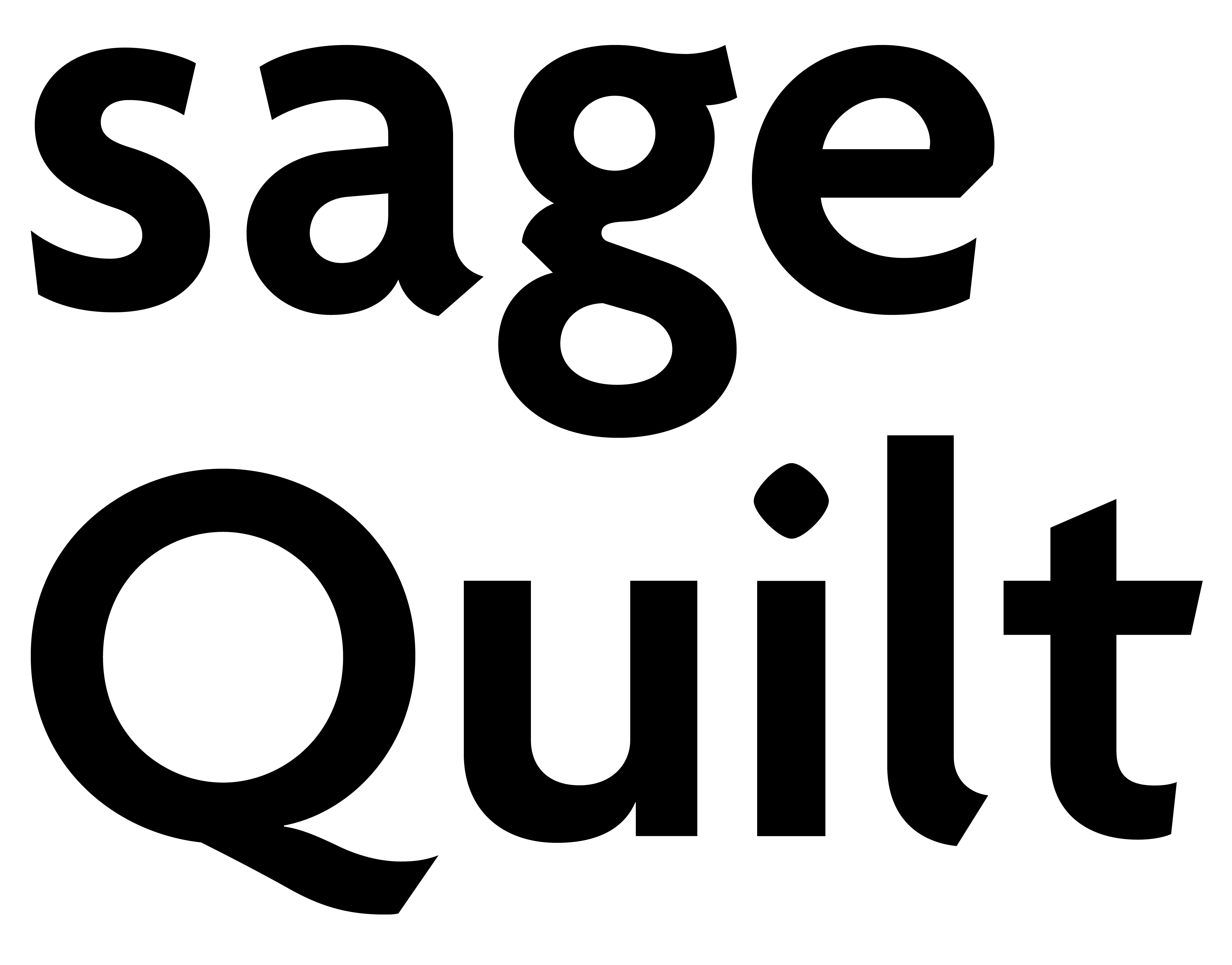
Agenda’s letter forms are distinctive, especially in the lowercase. One of the face’s most characteristic design details is the diagonal cut in the lowercase e. Thompson explains that the diagonal flavors many other characters in the typeface, too. “I thought it evoked Johnston’s wide steel nib, and used the gesture all over the place.”

“I did pay lots of attention to the small e. You’ve touched on a personal quirk of mine; I liked soft e’s. Maybe not to the extent of Ed Benguiat, but it was still a thing for me then. The diagonal worked on a couple of levels for me with the e. The lowercase g has a negative and a positive version of the angled stroke end.”

L is in the details Thompson also went back and forth over the design of the lowercase l, struggling to decide between the cleanness of the straight form and the legibility of one with a tail. “I worked as a typesetter, as well as being a designer, and it always annoyed me that many sans faces had little or no distinction between 1, I, l. (That’s number 1, cap eye, and lowercase el). I was aiming for the cluster of sans faces that anyone can use for anything: Helvetica, Futura, Univers, Frutiger, etc. … the bent lowercase l definitely took it out of that group. In the end I did it, but not without many reservations.” The name shows its qualities One aspect of Agenda that might not be obvious is that the name itself reflects the design — not so much the meaning of the name, but the letters in it. “I choose typeface names to show off salient features of the design. The names are mini-showings. For Agenda, I was especially interested in featuring the lower case g and e, but each letter says something important about the face as a whole. “Agenda was a two-axis design from the start. Nothing special now, but having point and detail compatibility across the range was an interesting technical challenge. Proportions also needed to change as the widths narrow. Agenda has old-style proportions in the wider styles and more uniform narrow widths. Also, as the widths narrow, the lowercase ascenders and descenders contract to maintain cohesive word shape silhouettes.”

Weight, weight, there’s more Thompson created Agenda Roman by drawing several master fonts and then interpolating from those masters, either horizontally or vertically, to generate intermediate styles. Then he had to inspect each interpolated glyph for interpolation artifacts that would would need to be corrected by hand.

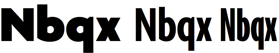
Weight and width map for Agenda Roman, with notes and interpolation values.

He drew the Medium roman weight first (M5 in the chart above), then the more extreme ends of the style spectrum. Not all of the master designs ended up in the final release; the thinnest and the most condensed (M1 and M3) were judged “outside the range of styles suitable for publication.” But they served as starting points. Thompson produced the Italic styles in the same way, using the same interpolation scheme as he did for the Roman. “It should be plain to anyone with an interest in such things that the tools used to make Agenda had a big influence on the end results. In upcoming new designs I hope to express more of the idiosyncratic vigor the old guys brought to their work. David manages to do it still, and I aspire to it.”